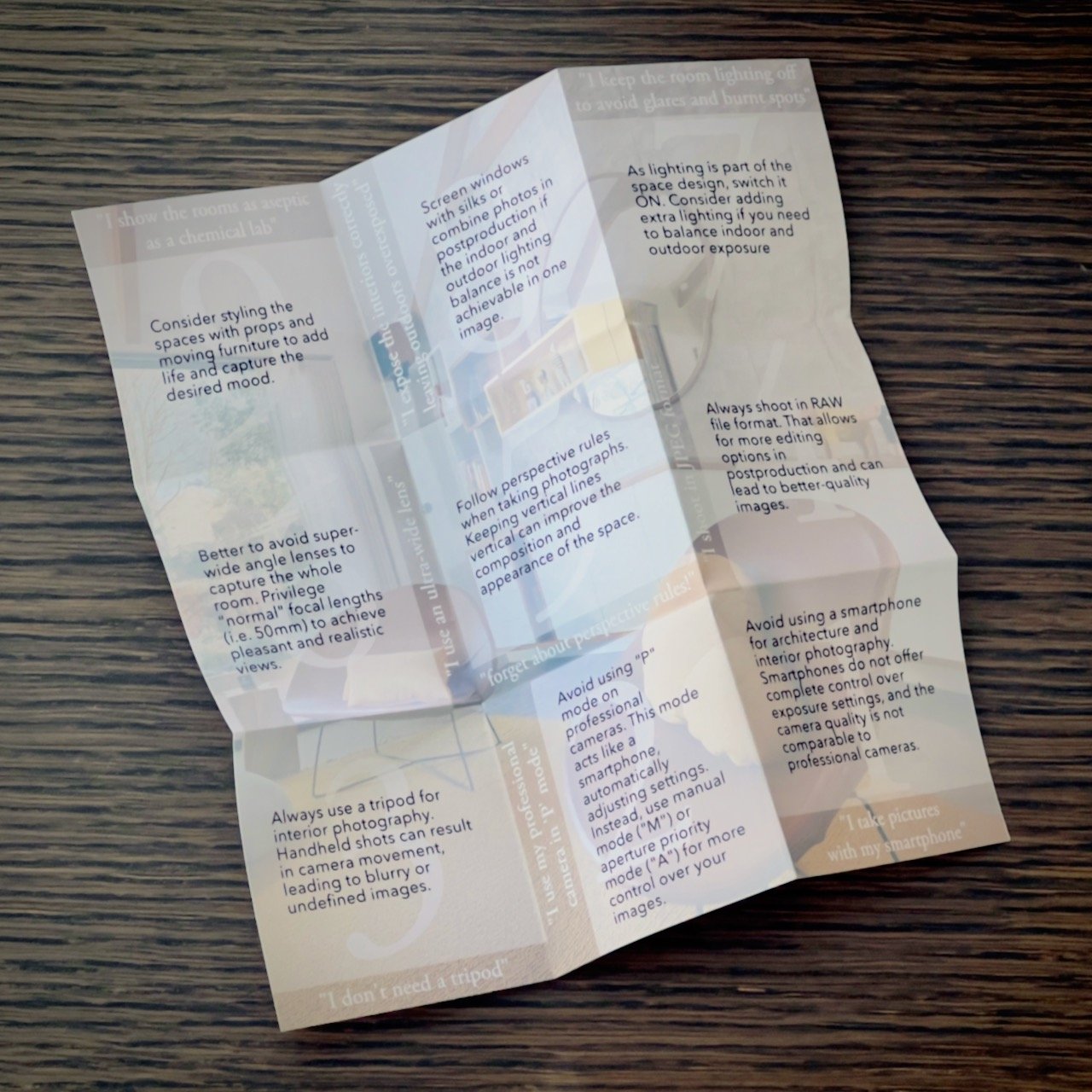
9 mistakes designers make when taking pictures of their projects
It’s incredible how many designers miss presenting their interiors in the best appealing way.
And having worked for almost twenty years as a RIBA chartered architect in the UK and in Italy, I was one of them!

a beautiful living room in North London by Mia Karlsson Interior Design
Download your free cheatsheet here…
(click on the image, and you will receive a PDF to print and keep with you)
During my career, I understood that a designer considers his detailed CAD drawings, skilful handmade perspective views and state-of-the-art computer-generated simulations as everything he needs to present his portfolio and attract new customers.
Photographs during construction and on completion are often ‘optional’, distracting the designers’ primary duty in directing the work, snagging defects and dealing with last-minute changes by their clients.
Furthermore, there is no chance to appoint a photographer on many occasions, being the optimal time-frame window squeezed between the final retouches and the handover to the client.
Then the designer thinks “I have a camera, I can take pictures by myself!”
Perfectly valid assertion! Raise your hand if you haven’t thought it at least once.
So, here is my advice, showing the 9 main mistakes – and solutions to improve your design’s pictures.
Mistake No.1 - “I take pictures with my smartphone”
Please don’t!

Using your smartphone for architecture and interior photography is not a smart move.
smart | smɑːt |
adjective
(2) informal (of a device) programmed to be capable of some independent action.
You want to be in control, not leaving to your phone decisions on how much is the contrast (highlights/shadows ratio), how wide is the depth of field (in-focus zone), or which is the light temperature (yellowish/blueish colour).
True, there are apps for smartphones that allow more control than the default one (see, for example, Focus, VSCO, ProCam, ProShot). However, no matter how many megapixels our phone’s camera has, the quality of the sensor, measured in a very complex (or barely understandable by humans) way, won’t ever be comparable to any medium-low range DSLR or mirrorless camera.
Mistake No.2 - “I use my professional camera in ‘P’ mode”

Well, you might be disappointed to know, but ‘P’ on your camera mode selector doesn’t stand for ‘Professional’. Au contraire, ‘P’ is the Program mode, where the camera behaves precisely as your smartphone, taking decisions by itself. But, then, again, no control from you!
Yes, that’s already a step better than using your phone, but why don’t you take full advance (a.k.a. control) of the professional tools you have?
Then, please forget that ‘P’ mode and experiment with how the other modes work. I strongly suggest using the magical ‘M’ – manual mode – but, if you feel a bit unsure on how to set the correct exposure, then go for ‘A’ – aperture priority mode – which gives you control over the depth of field (I will explain this feature in detail on following articles) yet leaving the camera doing all the other calculations.
Mistake No.3 – “I don’t need a tripod for my camera”
I agree; tripods are always bulky and heavy to bring along, annoying and time-consuming to set up.
Using the camera handheld is so much faster and allows us to check the best angle to shoot much more comfortably.

Unfortunately, we are living creatures. We all move. Even when we try our best to freeze, we can't keep any object in our hands motionless for a length of time of 1/60 second or longer. In my experience of more than ten years in interior photography, I can assure you that 90% of my shots require exposure times well longer than that.
And no, don't be tempted to crank up the ISO (exposure sensitivity) above the native value of your camera (usually 100 ISO) because that, although it shortens the exposure time, will deteriorate the quality of your picture. You will get more grainy and less defined images, which is not a good idea for interior photography unless you aim at that particular effect.
Then please, buy a tripod and use it all the time!
For the sake of this 'mistake', any non-wobbly tripod is better than nothing. I can be more specific about the tripod's quality and the head's characteristics (the movable joint between tripod legs and camera). Then please ask me if you need further information.
Mistake No.4 – “I shoot in JPEG file format”

No! Never! Unless you are snapping selfies of your holiday memories or the wonderful meal you had for your Facebook friends, please always shoot in RAW file format.
Here things start to be a bit technical, I know, but if you want to raise the quality of your project’s photos – and get positive feedback from your potential customers – you need to shoot photographs that are fully editable in post-production.
There is nothing to worry about; editing the photos on your computer can be as simple as tuning the exposure or adjusting the white balance, up to much more complex operations. But there is not much you can correct if you shoot in JPEG!
And if you find that the photo post-production is not for you – too complex to learn or time-consuming – you can send the RAW files to a professional photo retoucher who knows how to deal with them exactly.
Mistake No.5 – “forget about perspective rules!”
Let me ask something. When you draw a one-point or two-point perspective, how do you keep the vertical lines? You are answering ‘vertical’.

Then, why, when you take photos, you are tilting your camera randomly, getting a bizarre and unpleasant perspective?
OK, you might know that already, but let me stress the importance to keep those lines as vertical as they naturally are. The view will improve, showing the spaces in the most flattering way. That is also why it is essential to place the camera on a tripod and check its bubble.
There are exceptions, of course. But those views, where you aim the camera up, down or tilting left/right, need to be clear composition choices, not annoying tiny imperfections.
Mistake No.6 – “I use an ultra-wide-angle lens, to include as much as possible of the room”
That is not a mistake if you are a real estate agent and want to show that your property is more significant than it is!

Otherwise, to get a pleasant and realistic view, you shouldn’t shoot that wide. From a designer perspective, the aim is to get the viewer feeling as they were ‘inside the room’.
The best practice is to step away as far as we can go (near the wall or shooting through a door) and then use the longer focal lens we can (or zooming in) to include what we want to get inside the picture.
This method avoids perspective distortions (caused by an ultra-wide-angle lens) and many empty floors in the foreground.
Furthermore, as Mies van der Rohe was saying, ‘God is in the details. So you may want to get close to the objects you are capturing in the picture to show their fine details, their precious materials and the craftsmanship behind your project.
I found myself mainly using lenses as 28-35mm for general views and 85mm for detailing (focal lengths for a full-frame DSLR).
Mistake No.7 – “I keep the room lighting off, to avoid glares and burnt spots”
You are at the intermediate level, then, if you have already noticed that the photos of your beautifully designed interiors are unpleasantly burned out in the proximity of lamps, chandeliers and downlights.
Then you wisely decided to switch them off, solving the problem drastically. But, don't worry, you are not the only one… I have seen many so-called professional photographers doing that too!
But that's not what you have designed. You have spent time selecting the best lighting, the costly suspended light in Murano glass that your client loves. That very same feature that 'make the room', that beautiful light, is the one you want now to switch off because it doesn't show right in pictures? You must be crazy! LOL

project by Lighting Design Studio, photo animation by Marco Joe Fazio©
I admit it is not easy when we need to deal with hotspots (very bright areas). Then as a first (cheeky) solution, I would suggest framing the view differently, not including them in the picture. But that's not what we often want.
Then, if possible, the first thing to do is to dim those lighting, reducing the hotspot to a lower value. Those will still appear bright and 'live' in the picture, but there won't be giant halos and burned areas as if they were at full blast.
If that doesn't solve the problem (because the lighting is not dimmable or still too bright), then things get a bit more complex. First, you need to introduce 'extra ambient lighting' in the room, using additional sources (continuous or flash lighting) without making them too obvious and preserving the room's atmosphere.
Mistake No.8 – “I expose the interiors correctly, then windows and outdoor spaces are consequently way too bright”
design by Mia Karlsson Interior Design, photo by Marco Joe Fazio©
That is somehow similar to the previous mistake, except that we cannot switch off, nor dim, the sunlight!
It is always good to show the view from a window, a french door or a full-glazed partition.
However, while the human eye adjusts automatically and instantaneously to different light conditions, every camera sensor – some more, some less depending on their cost – have a limited ‘dynamic range’.
It means that when the indoor and outdoor lighting are very different in quantity (lux or electron-volts) and quality (light temperature), then ‘Houston, we have a problem!’
That is a fascinating yet complex phenomenon to explain, and I won’t get you bored here (but please ask if you like further info). What is essential to know is that we can deal with this problem in various ways:
adjusting the interior lighting in quantity and quality, most probably using extra light and coloured gels;
screening the sunlight with silks (translucent fabric) if the areas are reachable not too vast;
[intermediate technique] taking two shots of the same view, exposing once for the interiors and once for the exteriors (white balance has to be changed accordingly); then composing the two images in post-production;
[advanced technique] ‘painting with light’ in the dark areas on various shots, to be composed in post-production afterwards.
There is no best or worst in absolute, and each time, we should consider many factors in deciding which way to go. Most of the time, that will be a combination of two or more of the solutions above. But, again, only the experience will help you.
Mistake No.9 – “I show the rooms as aseptic as a chemical lab”
OK, that’s more a choice than a mistake. However, please consider this point.
Your clients – including the new prospects you want to win – expect you to design spaces that can feel like home, workplaces where they can feel like humans and not robots, leisure centres where they can enjoy the experiences. Correct?
Then the pictures you take of your design should show all of that. It doesn’t mean that you need to show untidy and cluttered spaces. It has to be instead a ‘planned fortuitous circumstance’. Although that sounds like an oxymoron, it is a very effective way of showing life in a picture.
How to achieve that? I have learned this secret working with skilful interior stylists.
floor by Porcelain Tiles, photo by Marco Joe Fazio©
Once you have decided the view (and fixed the camera on a tripod!), the first thing is to clear the room from unnecessary objects and clean each surface at best. It is incredible how much detail (and dust!) can show a high-resolution image.
Then furniture and props have to be moved to ‘look right’ for the camera. It means that, for example, in two-points perspectives, you may place pillows on a bed off-centre to appear symmetric, or curtains need to be pulled differently to appear centred in a window.
Lastly, it would help to break this ‘stillness’ with objects (only apparently) randomly placed. They can be, for example, a book open with reading glasses on a coffee table, a dress on a bed, a pair of wellies in the hall, a candle and a magazine near a bathtub filling with water and foam.
The options are endless. They need a bit of creativity and preparation.
Then remember, to bring your project’s to life, style, style and style again your photos!
You may know already some of these points. Then your photography is already at a reasonable level!
You could evaluate the ones you didn’t consider before to test your abilities and improve your photographic skills. Or maybe you prefer to appoint a professional photographer to see what they are capable of, enhancing your imagery and presenting your projects as they should be.
And please accept my apologies if I sound a bit bossy in my statements. But I can’t compromise quality when capturing interiors that have been designed and built with the utmost care and professionalism.
In future articles, I will cover in detail, with real examples and case studies, these and more topics, aiming to help you understand what makes a great picture.
Meanwhile, please feel free to ask for further information.
Kind regards,
Marco Fazio
creative director & photographer (AOP)